Homeownership Still More Affordable Than Renting In Most US Counties
Most people think that renting a home is a more affordable option than buying. But, as it turns out, in the majority of counties across


We blame the popular drug of the era, cocaine. It came with a price: color acuity. But ugly lurks directly under our noses. It hides behind dollar signs and caked, smiling celebrities on red carpets upon which strut the many emperors and their new clothes.
Pink. Enough said.
A winning combination in any competition for ugliest interior design!
For instance, this is a dental clinic (scintillating, we know)…
In our humble opinion, there ought to be more of a visual difference between the two.
David Bromstad, normally an interior designer of the first degree, created this unicorn paradise for an episode of Color Splash: Miami. While no immutable laws of color theory were necessarily broken, the bedroom is a classic case of inappropriate design. No teenager needs a headboard the size of a billboard announcing her virility, and no couple wants to engage in crazy acts of intimacy in a room colored like fruit salad.
With apologies to Jerusalem Pottery, a family-owned business that usually produces dazzling hand-crafted mosaics, this kaleidoscopic floral backsplash could inadvertently hypnotize unsuspecting chefs.
We can only imagine how quickly that must’ve gotten dirty. But if you have a special bathroom that’s only reserved for “when the Queen comes to visit” then this could be the perfect addition.
Just remember, only you can stop ugliness. So think smart. Build beautiful. Head to Modernize.com for design inspiration for you next home project.
Get our weekly email that makes communicating with your sphere on social actually enjoyable. Stay informed and entertained, for free.


Show your sphere your an expert. We have over 2100 articles covering every real estate topic your audience will love.
Position yourself as a real estate authority!
Real estate + topical events — the perfect match!
Become the bearer of good vibes!
Because hey, everyone loves to laugh!

Most people think that renting a home is a more affordable option than buying. But, as it turns out, in the majority of counties across
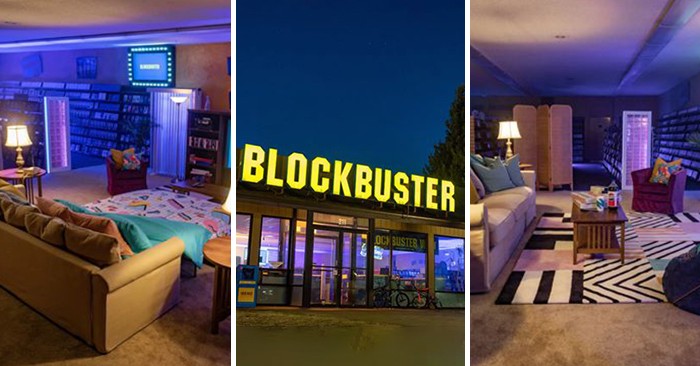
Most homeowners and real estate agents will agree that decor from the 1980s and ‘90s can make a room feel dated, and perhaps even unappealing.
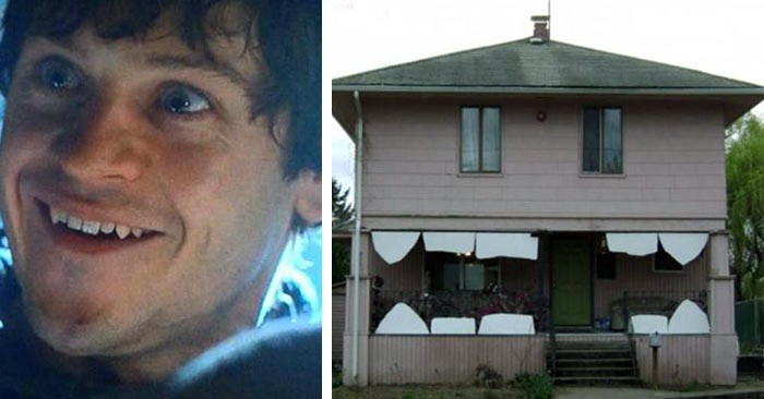
The internet is no stranger to humorous photos of inanimate objects that look like human faces. But in this case, we’ve assembled specific faces in
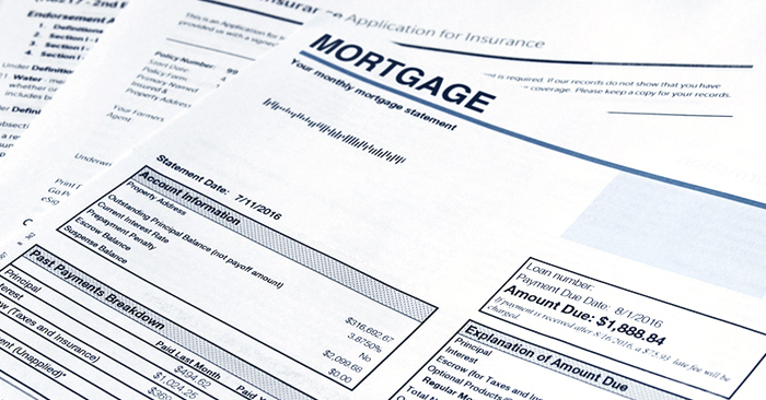
Many prospective buyers are concerned about the interest rates, where the market is headed, and whether they’ll be paying too much for a house if
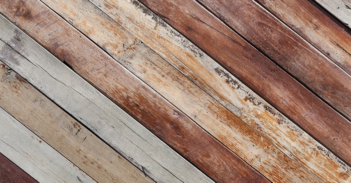
Over the last few years shiplap has been making waves as one of the most popular materials to incorporate in home decor. From walls and
Depending on your situation, it may not take the full 30 minutes.

This reset password link has expired. Check the latest email sent to you.
