Not That It’s Any of Kermit-the-Realtor’s Business, But…
Here’s 9 times Kermit almost butted into a real estate situation… but minded his own business instead. 1. 2. 3. 4. 5. 6. 7. 8.


We blame the popular drug of the era, cocaine. It came with a price: color acuity. But ugly lurks directly under our noses. It hides behind dollar signs and caked, smiling celebrities on red carpets upon which strut the many emperors and their new clothes.
Pink. Enough said.
A winning combination in any competition for ugliest interior design!
For instance, this is a dental clinic (scintillating, we know)…
In our humble opinion, there ought to be more of a visual difference between the two.
David Bromstad, normally an interior designer of the first degree, created this unicorn paradise for an episode of Color Splash: Miami. While no immutable laws of color theory were necessarily broken, the bedroom is a classic case of inappropriate design. No teenager needs a headboard the size of a billboard announcing her virility, and no couple wants to engage in crazy acts of intimacy in a room colored like fruit salad.
With apologies to Jerusalem Pottery, a family-owned business that usually produces dazzling hand-crafted mosaics, this kaleidoscopic floral backsplash could inadvertently hypnotize unsuspecting chefs.
We can only imagine how quickly that must’ve gotten dirty. But if you have a special bathroom that’s only reserved for “when the Queen comes to visit” then this could be the perfect addition.
Just remember, only you can stop ugliness. So think smart. Build beautiful. Head to Modernize.com for design inspiration for you next home project.
Get our weekly email that makes communicating with your sphere on social actually enjoyable. Stay informed and entertained, for free.


Show your sphere your an expert. We have over 2100 articles covering every real estate topic your audience will love.
Position yourself as a real estate authority!
Real estate + topical events — the perfect match!
Become the bearer of good vibes!
Because hey, everyone loves to laugh!

Here’s 9 times Kermit almost butted into a real estate situation… but minded his own business instead. 1. 2. 3. 4. 5. 6. 7. 8.

It hits you like a ton of bricks the first time you hear it could take months (or even years) for a real estate lead
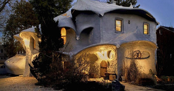
There are a lot of unique homes out there. Some look plain from the outside but are spectacular inside. Some flag you down from miles

Most people don’t buy their “forever house” right out of the gate. It’s hard to afford a home that has the size and amenities you

Robert Guthrie, of New Orleans, decided he needed a home that put the fuel back into his creativity. So, he bought and renovated a gas
Depending on your situation, it may not take the full 30 minutes.

This reset password link has expired. Check the latest email sent to you.
